
People usually pay the most attention and care to the face because it’s what others notice first. It will determine how employers, colleagues, and strangers respond to you. So just like your face, it would be intuitive to give careful thought to what your potential customers see first.
In the case of email marketers, it’s the email header. Aside from using helpful tools such as email marketing software, an email marketer should also be detail-oriented.
The email header is composed of the sender’s name, logo, subject line, pre-header, reply-to address, images, and links. It has two layers, the main header which contains the menu and logo and the second layer is the pre-header.
An excellent email header is clear and captivating. The brand should be noticed at first glance. The recipient shouldn’t need to think about who the sender is. It must be free from clutter so that the information can be absorbed by the receiver quickly. But despite its simplicity, there should be an excitement-factor to compel the receiver to check out the email. Aside from that, a great email header also maximizes its use so it’s easy for users to navigate.
Here are 5 examples excellent email headers:
1. Place a store finder.
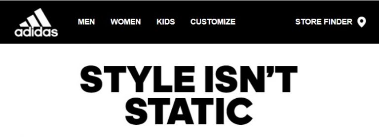
This header by Adidas is elegant, neat, and very useful. All the elements they used have represented their brand and it is free from clutter. The bold header text surrounded by generous white space makes the message crystal clear.
Aside from acing the basic elements of a great header design, they also managed to add a unique store finder icon which is a very user-friendly feature. The goal of every marketing strategy should be to shorten the length between the first touch-point and conversion. Adding a store finder in the email header is one way to do that.
2. Add a simplified navigation menu.
Emails provide a great medium for your audience to interact with your brand even without them visiting your website. You can take advantage of this by placing a convenient navigation menu.
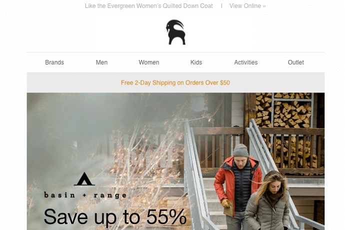
Here’s one example from Backcountry, an online store for outdoor gear. If you visit their website, you can see many categories in the navigation bar. But for their email, they only added the most relevant categories.
Minimizing the options for your audience simplifies their decision-making process. This will enhance the possibility of them making a good choice. Research has proven that having too many choices is not a good thing because it leads to choice paralysis.
3. Add links to the most relevant or best-performing articles.
This is an easy way for you to promote your content. The subscriber can go directly to your article even without browsing through your email. This is mostly applicable to magazine and news websites.
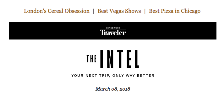
The header below by Conde Nast Travels has three links to relevant articles. The headlines are in contrast colors so they can easily be noticed apart from the details below. They have also chosen a simple and clear design.
4. Include discount information.
Making freebies, loyalty points, and discounts visible at the first part of your email will enhance your subscriber’s excitement in checking out your email. This is one of the strategies that will set your email apart. Because who doesn’t love discounts right?
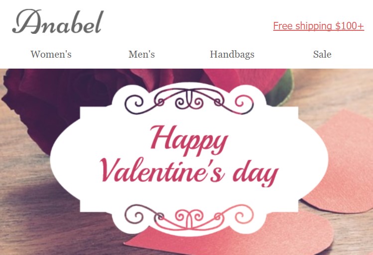
The header below by a cosmetic brand named Anabel allures audience with its free-shipping link on the top right part of the header. Their design is also on point. It is minimal but chic. The colors, shapes, and fonts reflect the brand so well. Every text is valuable and nothing is out of place.
5. Make your design interactive.
Do not miss any chance to engage with your audience. Yes, you can start engaging with your audience using the email header.
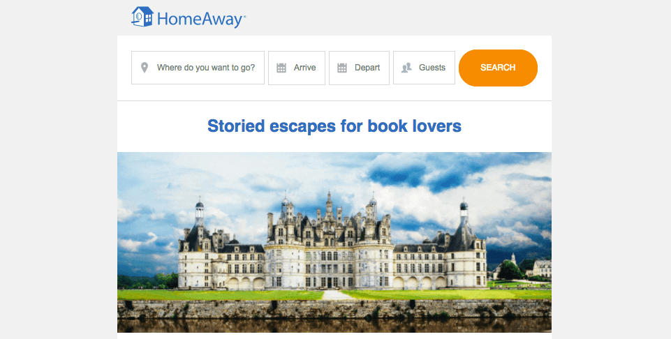
The vacation rental website HomeAway made a very smart move by adding an interactive navigation menu. There are entry fields for destination, dates, and number of guests. The entry fields were also designed to be a part of an image. Aside from their bold logo and striking headline, they have also added a full-size picture of a castle, a dream destination for many.
Conclusion
The email header is one of your first chances to prove to your subscribers that your message is worth their time. You can do this by doing all of the pointers mentioned above.
First, do not forget to keep your pre-header text compelling. Remember, you are battling against thousands of other emails; generic wordings won’t cut it. Next, make your brand and logo stand out. Make the menu relevant, brief, and free from clutter. And, to truly stand out, add exceptional details like store finder, discount information, and interactive entry fields.
These little details will move you towards meeting your sales targets. If you have placed your best effort on the head part, your audience can’t help but notice and all the rest will come easy.